What does an “it” logo look like in the fashion/luxury market today? If this past year is any indication, it looks a lot like Loewe’s Anagram logo, which, according to Lyst’s annual Year in Fashion report, was “the most wanted luxury motif” on its platform during 2023. The sheer popularity of the logo – which Lyst describes as consisting of a “quadruple-L insignia,” can be described at least in part by the design, itself. It is a subtle-but-distinctive (i.e., identifiable) indicator of the source of goods upon which it appears. This has likely helped Loewe to toe the line between consumers seeking out less bold branding (in furtherance of a larger shift – among some consumers, at least – towards quieter luxury goods), and those that are still looking to make statements by way of their apparel and accessories, something that is often accomplished by way of the logos and other trademarks that appear on those wares.
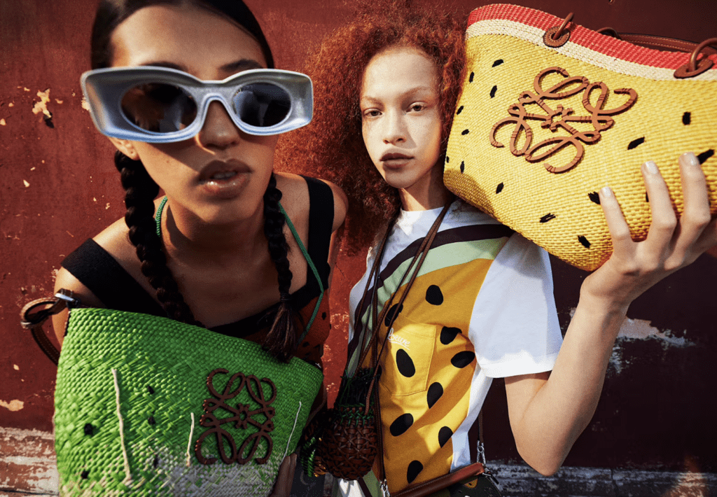
The Anagram logo is likely also successful because it is an impressive example of branding that works across mediums – and across markets. Loewe uses it as a digital indictor, with the logo serving as its profile icon on social media platforms like Instagram and X (aka Twitter), for example, and as the favicon that appears next to its website page title on a user’s browser tab. At the same time, it can be seen on tangible Loewe products, with its uses going “beyond the typical hardware add-on just found on luxury belts and handbags,” per Lyst, to serving as a focal point on Loewe’s $400-plus Anagram tank tops and woven-raffia basket totes. (There is something to be said about the execution and far-reaching-applicability of this logo, particularly as many companies (in fashion and beyond) have gone back to the drawing board in recent years and adopted highly-pared-back branding that is meant to work well in the era of omni-channel commerce, which demands marks that can be applied to brick-and-mortar store signage and high-quality Instagram imagery, alike.)
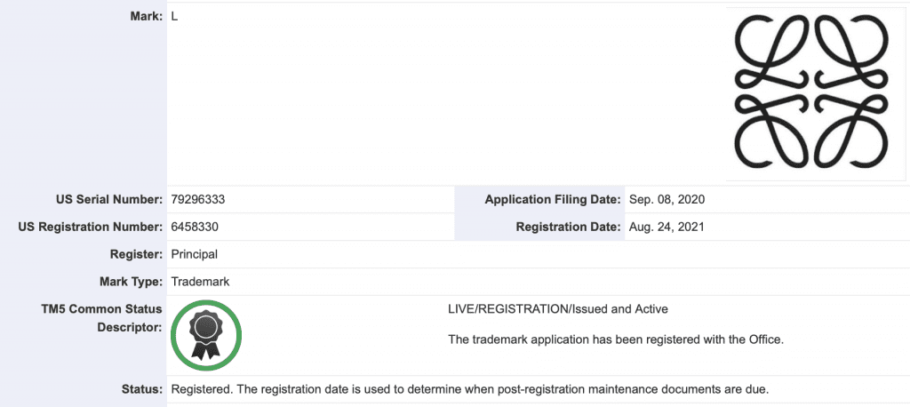
Maybe more interesting and more important that the alluring design of the Anagram logo and the practical benefit of that design is that the popularity of the logo seems to be a clear nod to the fact that LVMH-owned Loewe, itself, is thriving. Specifically, under the creative direction of Jonathan Anderson, who has been in the top creative role since 2013, the 178-year-old fashion house has been re-built into a thoroughly modern – but still craftsmanship-centric – luxury brand with “it” products and international appeal.
Or as Lyst put it in its Q2 2023 Index, which ranks fashion’s hottest brands and products, “Loewe is the hottest brand in the world. One of the oldest luxury houses … the Spanish brand has undergone a renaissance,” taking the top spot on the Lyst Index for the first time ever in 2023. Summarizing the enduring rise of Loewe, Lyst stated, “In the attention economy, with brands fighting for relevance and front of mind, Loewe’s commitment to craftsmanship has succeeded in capturing the imagination of different cohorts of customers, driving brand heat that is backed up by surging demand and sales for hero products online.”
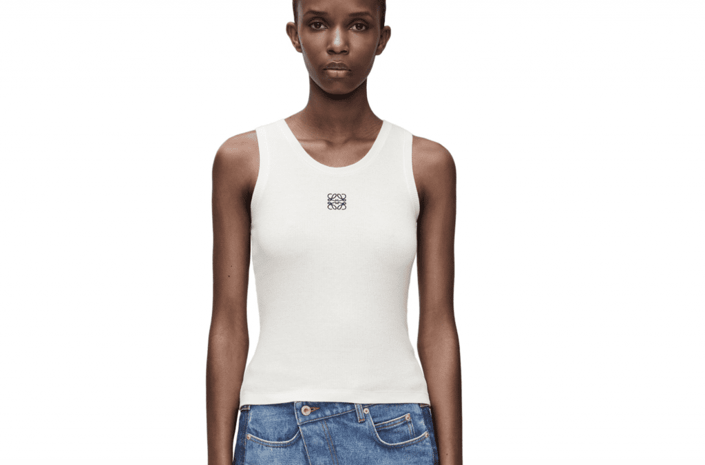
Reflecting on demand for the company’s products, many of which display the Anagram logo, Lyst revealed last year that Loewe’s popular Anagram basket bags “secured cult status, with searches up 170 percent year-on-year, and a halo effect on searches for dupes online.” (Lyst also noted that demand for the Paula’s Ibiza editions of the basket bags “spik[ed] [in 2023] thanks to smart seasonal updates on the timeless design.”) At the same time, the fashion discovery platform reported that Loewe’s Anagram tank top “became the hottest product of the second quarter [in 2023], with searches rising 132 percent year-on-year, [and] demand for the brand’s Anagram jeans reached an all-time high in June.”
Growing demand for the Loewe brand and its offerings is a clear indication that effective logos, including its Anagram symbol, are just part of a larger ecosystem when it comes to branding. In other words, logos (and other examples of branding) mean nothing – and are likely worth noting – in isolation; they are purely a means of communicating qualities and values of a brand that have to exist first and foremost, and then can be embodied in logos and other trademarks. In short: Loewe’s logo works because this brand works.
THE BOTTOM LINE: This is all to say (and this will not be new information for trademark practitioners) that while it is tempting to consider the visual factors that stand to make a trademark successful in the modern market, and while there are certainly some “bad” logos out there that do not resonate with consumers for various reasons, including aesthetic ones (Gap’s attempt at a rebrand, coined “Gapgate,” still comes to mind), the biggest driver of what is likely to make a logo successful today (and in years prior) is almost certainly not what it looks like. It is far more dependent upon the foundation/goodwill, strength, heat, etc. of the brand behind it. Loewe is a timely example of that.


