In the late 1800s, thirty years after Levi’s first set up shop in San Francisco, it adopted its now-famous logo – one that depicts two horses attempting to pull apart a pair of Levi’s pants. The purpose of the ornate logo was twofold: it “symbolizes the strength of the clothing in the face of competition,” per Levi’s. It also provides consumers “with a memorable image to guide them,” the brand claims. “Our early consumers could walk into their local general store and ask for ‘those pants with the two horses,’ and they would get a pair of Levi’s jeans.”
With its depiction of a pair of jeans alongside the words “quality clothing,” the logo-emblazoned patch that began appearing on Levi’s trousers beginning in 1886 is a literal representation of what the iconic American denim brand offers. Such a logo is the focal point of a new study conducted by marketing professors Ammara Mahmood, Mudra Mukesh, and Jonathan Luffarelli.
A effective trademark – whether it be word, name, symbol, logo, or any combination thereof –regardless of its design, “can help pique the interest of consumers, differentiate brands from competitors, facilitate brand recognition, influence investors’ decisions, and convey what a brand is all about,” according to Mahmood, Mukesh, and Luffarelli. Nonetheless, in connection with their study of 597 different company logos, they found that the design characteristics – or the lack thereof – in a logo are significant, as they “can considerably impact brand performance and consumer behavior.”
They found that in many cases, expressive – or in their words, “descriptive” – logos, such as the one that Levi’s adopted back in 1886, can prove more effective at boosting brand equity than those with design elements that are not indicative of the type of products or services that the brands are selling. To be exact, the professors found that logos with expressive elements – i.e., logos that include “textual or visual design elements or a combination of the two that clearly communicate the type of product or service a brand is marketing” – tend to “make brands appear more authentic in consumers’ eyes.”
Beyond that, they can “more favorably impact consumers’ evaluations of brands, more strongly increase consumers’ willingness to buy from brands, and more significantly boost brands’ net sales” than logos that lack descriptive elements.
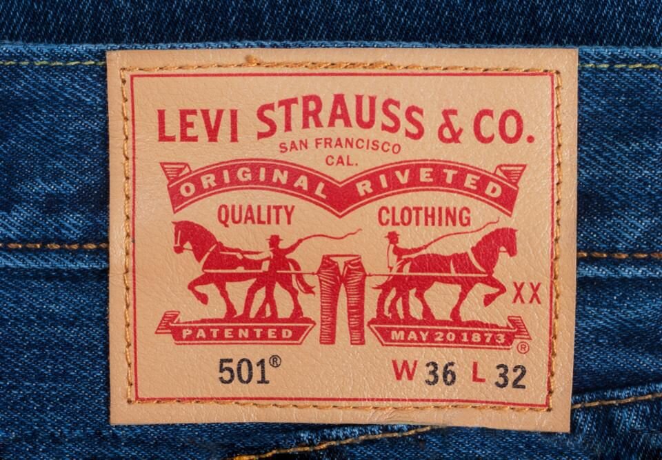 image: Levi’s
While they found that on average, logos with descriptive elements are “more likely to improve brand performance,” there is a substantial caveat to this seemingly bright line rule: “the benefits of using a [descriptively-designed] logo are not experienced in the same way by every brand.” In fact, in comparing the effects of using an expressive logo for brands that are “familiar to consumers” versus brands that are less known, a noteworthy pattern emerged.
Mahmood, Mukesh, and Luffarelli observed that “although having an [expressive] logo had a positive effect on brand equity for both familiar and unfamiliar brands, the magnitude of this positive effect was much smaller for the familiar brands.” They state that this is “easily explained by the fact that, when consumers are familiar with a brand, they know more about it and are, thus, less likely to be influenced by the logo design.”
It is in line with this finding that the Levi’s branding has evolved significantly since 1886. Most of the denim giant’s pants do still bear its 133-year old patch but the company, itself, has shifted to a far more simplified and much less expressive logo, the word Levi’s inside what it calls a “Batwing” shape. Another staple of the company’s branding? A simple pocket tab located on the right back pocket of its jeans, which may – or may not – bear the word “Levi’s.”
The takeaway: consumers are generally familiar with the brand’s offerings, thereby, removing the need for the company to constantly remind them of what those offerings are. (The adoption of a less expressive (and thus, less restrictive) has also helped to pave the way for the brand to expand beyond pants to t-shirts – which they apparently sell a whole lot of, sweatshirts, outerwear, and accessories).
This trend towards visual de-branding goes beyond Levi’s. When it comes to high fashion brands, few of which have tended to adopt expressive logos even at the outset, many have moved even further away from so-called “descriptive” design elements, and instead, have been undergone something of a significant revamp (or maybe … devamp?) of their logos in recent years in light of a larger design trend towards simplification. In part, this has been facilitated by the cross-brand use of a handful of the same graphic designers, such as Peter Saville, for instance, who created both Calvin Klein and Burberry’s new logos and related branding, and German creative firm Bureau Borsche, which was responsible for Balenciaga and Rimowa’s rebrands.
Technically speaking, a turn towards pared-back logos comes as many high fashion brands are opting to address the “tremendous design challenge” at the center of their inherently omni-channel operations. Straightforward, easily-transferrable and super-scalable branding – which works across all digital platforms – has proven to be a direct result.
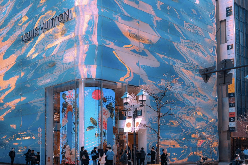
It is worth noting that like mass-market brands, such as Levi’s, high fashion and luxury brands likely do not need to describe the types of goods and services they offer to consumers, as they are some of the most famous brands in the world. At the same time, though, while luxury fashion brands (i.e., ones that demand that consumers go out of their way to pay often eye-popping prices for their wares) are extremely dependent on the power of their logos, they cannot rely exclusively on a descriptive logo to communicate their brand values to consumers. Instead, they engage (and have, in many cases, engaged for many decades) in significant legwork in order to have the ability to successfully use non-descriptive branding elements.
In order to readily command the prices that they do (in light of producing increasingly large quantities of accessible products, including licensed goods and more entry-level products aimed at driving revenues and pleasing shareholders), and keep consumers routinely shopping on a seasonal basis, branding efforts at the upper echelon of the fashion industry are much more intensive and elaborate than any single element of branding, whether that be a design that literally depicts “quality,” as Levi’s patch does, or that consists of a pared-back word mark, even if logos (and the goodwill associated with them) that often drive consumers to shop these brands in the first place.
Rather then being able to simply slap a logo on their products, or better yet, in order to be able to slap a logo on their products, fashion brands need to consistently spend enormous sums of money in furtherance of their story-telling efforts – from runway shows and celebrity campaigns to large-scale gifting to famed figures – in order to give that logo meaning and thus, impart an image of luxury upon consumers to justify their prices to both new and existing customers.
In other words, logos are just the tip of the iceberg for them, as simple – and ideally, elegant – as they may increasingly seem on the surface.


