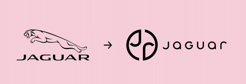
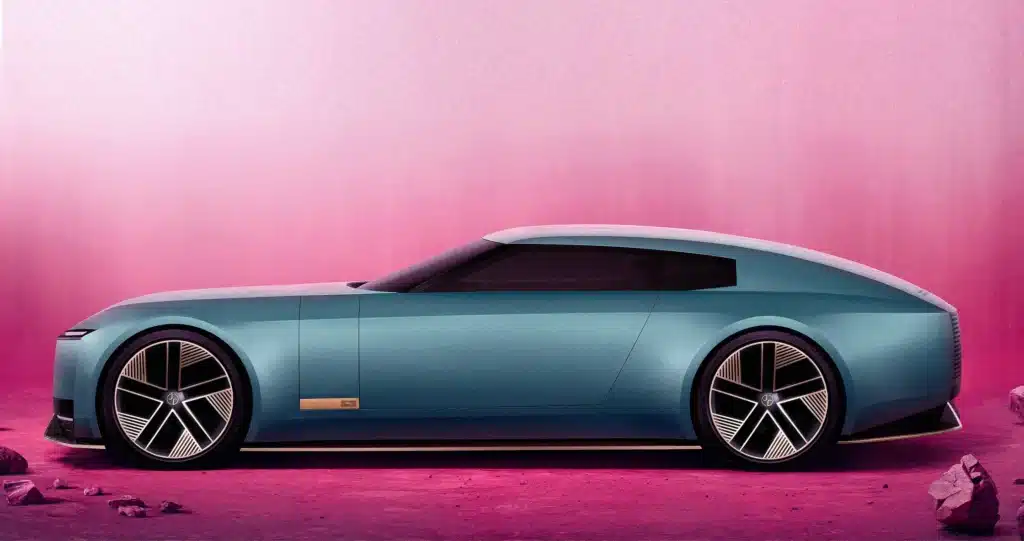
Forbes put it well this week when it stated that Jaguar “unleashed a firestorm” when it introduced the new vision for its brand ahead of its unveiling of its new EV concept car at Miami Art Week on Monday. Putting the design of its Type 00 car aside, the Tata Motors-owned company wiped the slate pretty clean when it comes to its word mark, logo, and other critical elements of its brand. In place of its old Jaguar wordmark (which took the form of a modified version of the Optima font) is a rounded, sans-serif typeface that consists of a mix of upper and lowercase letters. The company also introduced a J-centric logo and a streamlined version of its leaping cat in furtherance of its rebrand, which the company says is its take on “exuberant modernism.”
Calling the revamp “the biggest change in Jaguar’s history – a complete reinvention for the brand,” a company spokesperson states that “Jaguar is undergoing a complete renaissance from 2025 to emerge as a luxury brand.”

> While many very well may have viewed Jaguar as a luxury brand prior to this new branding endeavor, the automaker seems to be looking to move more upmarket, which will inevitably be reflected via price increases beginning in 2025. Wired reported this week, “We do know that you’ll need at least £100,000 ($127,000) to buy one. Jaguar’s current average transaction price is around £55,000, and this is nowhere near the luxury price point the brand wants to reposition to.”
Reflecting on the revamp and the new concept car, Jaguar’s managing director, Rawdon Glover, said, “We have forged a fearlessly creative new character for Jaguar that is true to the DNA of the brand but future-facing, relevant, and one that really stands out.” And the revamp has certainly garnered attention – albeit many of the responses from branding professionals have been somewhat scathing. For example …
Odin Christophe Rolland, Strategy Director at BrandingAge, said: The critique of Jaguar rebranding is not about its radical nature—brand identities do evolve, and sometimes that’s necessary. The issue lies in what could be described as a “symbolic purge,” where the brand is seemingly annihilated … The result? A rather unremarkable visual identity, reminiscent of the ‘blanding’ phenomenon.”
Meanwhile, Base Design Creative Director and Founding Partner, Thierry Brunfaut stated: “Blanding is everywhere, and Jaguar just fell victim to it. This rebrand strips the brand of its soul, erasing its rich history and cultural essence. The emotional connection we had with Jaguar? Gone – replaced with a lifeless void. The new logo, monogram, and campaign? They could just as easily belong to a fast-fashion chain or a candy store. This isn’t radical; it’s radically stupid.”
This is a short excerpt from a weekly briefing that is published exclusively for TFL Pro+ subscribers. For access to all of TFL’s content, including our weekly briefings, inquire today about how to sign up for a Professional subscription.


