


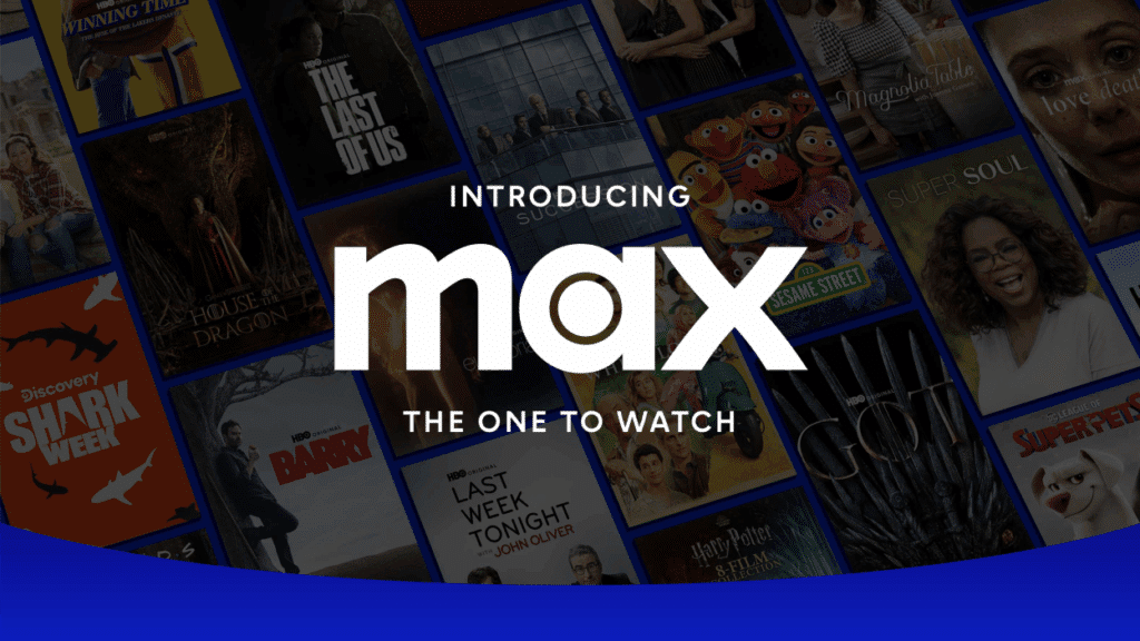
Warner Bros. Discovery recently announced that its streaming app Max will revert to the name HBO Max this summer. The move comes just over two years after a rebrand that saw HBO dropped from the name. The announcement has sparked a wave of commentary on social media, including some self-aware humor. HBO’s social media team, for one, has posted memes from shows like Friends and Euphoria, joking that the company had finally “come home.”
The background is this: HBO Max launched in 2020, promising to offer big-budget television series alongside the Warner film catalogue. The big change came in May 2023 when the service’s name was shortened to “Max” following a $43 billion merger that created Warner Bros. Discovery (“WBD”). Dropping the HBO was a head-scratcher. At the time, many viewers and analysts were stumped: Why remove HBO from the mix when the name is so well associated with award-winning television?

The sentiment was captured by brand consultant Debbie Millman, who told Fast Company in May 2023: “I am completely bewildered by the HBO Max rebrand. HBO took four decades of prestige and casually tossed it all into a dumpster, lit a match, and cheered as it burned.”
Fast forward to May 14, and WBD CEO David Zaslav announced the return to HBO Max. The major branding U-turn offers a clear lesson for marketers: When a rename threatens familiarity, consistency, and clear messaging, customers will push back.
Brand Familiarity: A Memory Shortcut
The HBO Max rebrand saga highlights just how quickly brand equity can be undermined when recognition cues are disrupted. Although the 2023 name change from HBO Max to the simplified Max aimed to reflect a broader content mix, it unintentionally distanced the platform from its most recognizable asset. HBO, as both a name and a legacy, had become shorthand for a specific level of quality (and an emphasis on quality over quantity) – one that audiences were not ready to see stripped away.
Brand familiarity may be described as the ease with which consumers recognize, recall and understand a name based on prior experience. In marketing, brand familiarity is a key factor in driving consumer confidence and supporting stronger emotional ties. In other words, when the existing memory structures are already in place, it reduces the cognitive effort that typically results in a more favorable action. Dropping “HBO,” a label linked to award-winning dramas for decades, removed a trusted shortcut and left viewers asking whether the service had changed its focus.
Consistency & Keeping the Audience
One of the key drivers of brand engagement is brand consistency, which is the uniform application of brand elements such as colors, logo and tone. This consistency is typically associated with trust and loyalty. The shift from HBO Max to Max disrupted this consistency, leading to confusion about the platform’s identity and offerings. Consumers who associated HBO with certain types of content were unsure what to expect from Max.
To make matters even more challenging, Max not only changed its name but shifted from the purple-and-black palette of HBO Max to blue, then to silver-on-black before finally circling back. Each redesign forced viewers to get used to a new look and tone, eroding the sense of continuity that subscription services rely on. Missteps in messaging can sink even well-researched rebrands. Communications firm Edelman’s 2023 Trust Barometer points out that silence during change amplifies speculation and negative assumptions.
The quick collapse of Gap’s 2010 logo makeover offers a classic example. The retailer unveiled a new mark without preparation, then reverted within a week after a backlash. A direct parallel can be drawn between that episode and the confusion that followed the Max launch, where any reasoned arguments for the shorter name never reached much of the audience. By contrast, the 2025 reversal was accompanied by plain statements from Warner Bros. Discovery, intensive press outreach and humor that admitted the misstep, which is a communication style more likely to rebuild trust.
Lessons for Marketers
Customer research should always precede radical changes to familiar signals, because the goodwill embedded in a long-running name is not easily replicated. Any shift in title or visual identity must be matched by consistent deployment across every touch point, from app icons to ad copy, otherwise confusion undercuts the strategy.
Finally, customer perceptions cannot be an afterthought. Clear, timely messages that are supported by a tone that suits the brand’s personality will help audiences understand what is changing and why it benefits them, turning potential backlash into renewed engagement.
Share


