“The new logo has a heavier, bold look with a geometric sans-serif treatment.” This is what Bloomberg’s Rob Walker wrote about the redesigned logo that Burberry debuted in August 2018. While Walker was specifically addressing the polarizing logo of the then-162-year-old British brand, he actually could have been discussing any number of recently (and relatively recently) revamped logos – from Balenciaga and Berluti to Saint Laurent and Rimowa. As part of a larger trend in branding, or better yet, blanding, a growing number of high fashion and luxury companies – and other consumer goods and tech companies, as well – are looking to spartan logos “designed not to stand out at all, but to blend in.”
Logos meant to blend in? That is an interesting notion if you consider the practical purpose of branding in the first place. Trademarks – i.e., brand names, logos, monograms, colors in some cases, etc. – have traditionally been used and have derived their value from their ability to enable consumers to easily identify the source of goods/services and distinguish such offerings from those of other. Given the increasing number of brands contributing to the mass-simplification of logos, it is worth wondering what, exactly, the blending movement means from a legal perspective, how we got here, and what the broader cultural implications might be.
Trademark Considerations
From a legal point of view, one of the key concerns when it comes to rebranding is the potential relinquishment of trademark rights in a prior logo or specified stylization of a word mark. Trademark rights are amassed and maintained in many jurisdictions, including the U.S., as a result of actual – and consistent – use of a mark. As such, the discontinuation of a stylized brand name or logo could give rise to complications (including in the event that a company attempts to enforce its right by way of infringement actions and/or oppositions) even when a brand maintains registrations for such marks.
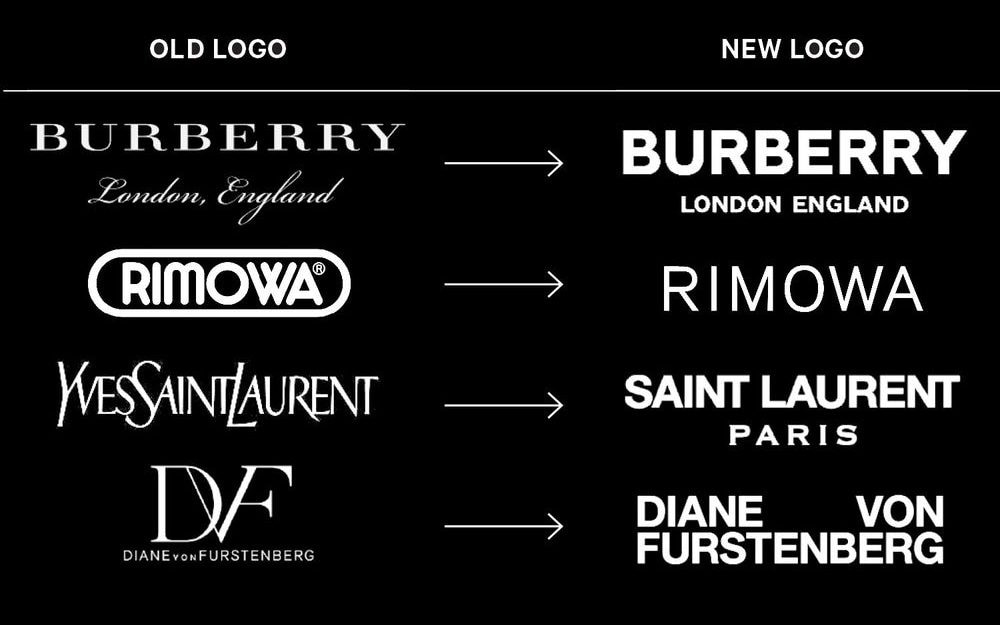
This issue is “particularly relevant if that previously-held logo was used for an extended duration, and was recognized and beloved by consumers,” as Sterne Kessler’s Ivy Estoesta and Monica Talley have noted. “At issue in such a scenario will be the need to establish trademark rights and consumer recognition from scratch in a new logo, which will take time and resources, and will also require ensuring that the new logo does not infringe any other parties’ already-existing marks.”
Against that background, “Companies that wish to refresh their branding but benefit from the goodwill surrounding a prior mark should consider modifications that update – and thus, do not completely change – the commercial impression of the brand.” In such a scenario, “A brand owner may be able to rely on the doctrine of ‘tacking’ in a later procurement or infringement matter, which allows a trademark user to ‘clothe a new mark with the priority position of an older mark.'” While this “sounds simple in theory,” Estoesta and Talley caution brands, noting that the application of the doctrine “is more challenging because the determination of legal equivalency depends on whether the two marks ‘create the same, continuing commercial impression such that the consumer would consider them both the same mark,’ as the Federal Circuit stated in In re Dial-A-Mattress Operating Corp.“
The flip-side here is that the overarching trend of blending may actually help companies to secure more robust rights in their valuable brands marks. It could be argued that brands stand to increase the strength of – and the scope of protection for – their marks by adopting such a less-is-more approach. As London-based trademark attorney Birgit Clark told TFL, a brand “should always try to register a plain word trademark.” That way, she says, the distinctiveness of the mark “will rest on the word(s) rather than any stylization of those words.”
With that in mind, brands will be able to “go after similar or identical trademarks in any kind of stylization or in combination with a logo,” for example, as opposed to merely being able to claim infringement if the name and any decorative elements are similar. In short: the more distinctive a trademark, itself, is, the wider its scope of protection will be. From this standpoint, the new trend of bland logos bodes well for brands.
“Just Good Business”
Speaking more broadly, there is something to be said about the simplification of logos, a move that has largely been attributed to the desire of brands to use the same logo more seamlessly across multiple formats – from digital platforms like e-commerce and Instagram to tangible mediums, such as billboards and shopping bags, etc. In this way, Base Design creative director Thierry Brunfaut wrote for Fast Co., the adoption of bare bones branding “is just good business.”
The widespread adoption of newly sans-serif-centric logos is also likely due (at least in part) to the reliance of the same handful of individuals’ or companies and their aesthetics. Famed graphic designer Peter Saville, for instance, created both Calvin Klein and Burberry’s new logos and related branding. German creative firm Bureau Borsche was responsible for Balenciaga and Rimowa’s rebrands, as well as recent bland-centric revamps for menswear site Highsnobiety and Nike. The list of commonalities goes on, just as it does elsewhere in fashion.
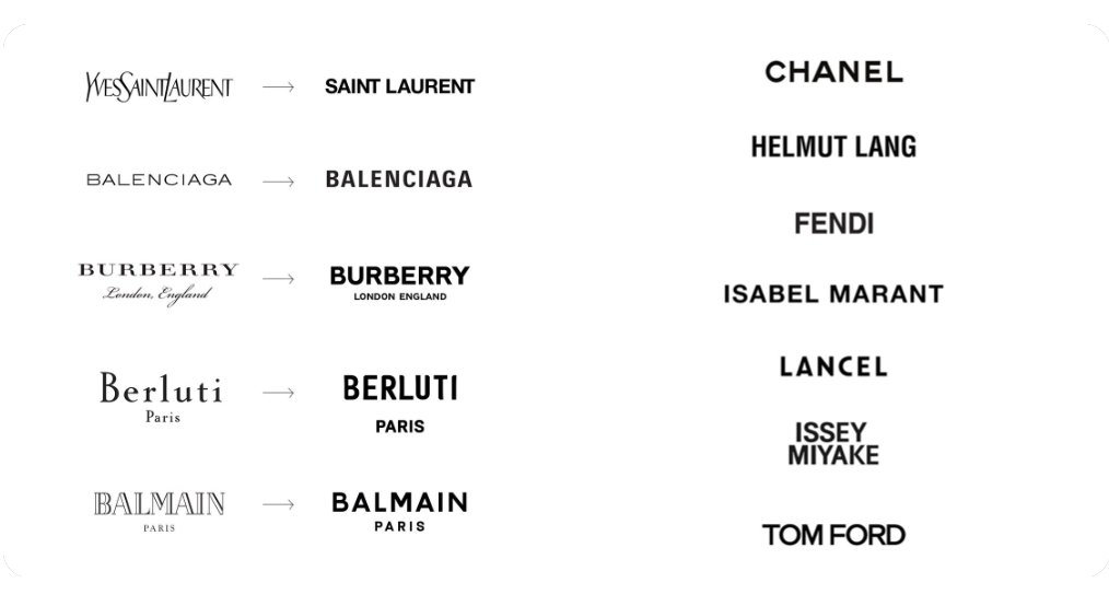
Beyond that, the uniformity in design is almost certainly a symptom of the larger approach to modern fashion, which is becoming more formulaic and corporate. Amid an increase in industry consolidation, a growing number of fashion brands are owned by publicly-listed parent companies, making the stakes higher from a revenue growth point of view. As a result, these companies tend to be run in an increasingly-risk-averse manner (compared to more independently run and independently minded entities). Therefore, much of what the industry’s big, conglomerate-owned companies produce – from high-margin accessories to their meticulously-crafted brand messaging – is the product of things like trend forecasting and careful metrics.
As for the blending trend, itself, it speaks to the larger state of things in consumer goods sales, as well. After all, consumers – particularly high fashion ones – are not necessarily shopping in the same way as they used to. The rise in omni-channel operations calls for a “tremendous design challenge,” per Brunfaut, and as such, brands have opted for the straightforward, easily-transferrable and super-scalable logo.
More than that, an ever-growing percentage of luxury goods sales, for instance, are occurring online, where labeling tends to be clearer than it is in multi-brand stores. This has had a practical impact on the need for – and the utilization of – logos. Look no further than the Saint Laurent Sac De Jour bags being offered up by Net-a-Porter. They have the simplified (under the direction of Hedi Slimane) Saint Laurent logo on them; the bags are also being sold under a bold Saint Laurent brand identification tag on the website. This is demonstrative of the fact that the practical need for a super easily-identifiable logo on a bag, itself, is in the digital era is arguably less intense than when consumers were shopping in brick-and-mortar department stores.
Whether that means brands should continue to opt for logos that look very much alike, all more-or-less blend together, and potentially, fail to distinguish one brand’s products from another’s (even if that is less likely than in generations prior), that seems like a negative.
This article was initially published on December 19, 2018.


